top of page

journal entry #1
Two main adobe software programs we use in computer graphics are illustrator and photoshop. Photoshop is an app that you can use to create your own work. In photoshop you can also put images in your work. For some examples see the photoshop page. illustrator is kind of the same thing you can add shapes you can also make your own logos.
journal entry #2
journal entry #3
What is the meaning of vector? vector means quantity having directions as well as magnitude especially determining the position of one point.
what is the meaning of raster? raster is a rectangular pattern of parallel scanning line.
7 basic of good design. line, shape, form, color, value of space. this is an example of basic element

These element are used for art and they are shapes, pattern's, and color. there are circles, squares, rectangles, and there are even lines like zigzag, spiral. it even is shading, and dots.
The shapes in the pic are all used in art. The circle to make a frisbee the square to make a block the triangle to make spikes the oval to make a carpet and the rectangle to make a brick. All the shapes are all used in art.
journal entry #4

journal entry #5

The picture you see has shapes. these shapes are always used in art. The shapes are in a lot of different kinds of art. The first shape is a cone. The cone is used in art for making ice cream and making spikes. the second one is a sphere it is used in art to make a ball or some times a nose. the next one is a cube it is used in art by a block and small brick. the last ones are a cylinder used in art to make a cup to make a cylinder box.
journal entry #6
Colors is an one important element in art because color shows expression to your art. color shows if in your art if its sad, happy, angry, exited, etc.

journal entry #7
Value is the range of light and dark. shading added to the picture. contrasted to show the unlikeness.
journal entry #8
The image you see is called pop art. pop art is really interesting because in the image it is black and white. you can see an elephant and some trees.
journal entry #9

Contrast as a principle of design is used in art by light and dark colors, rough of smooth, large and small shapes.

Emphasis is another example of principle of design. Emphasis is a drawing, a picture that has some sort if image that has all the same shape but one of the objects will have a different color maybe a different face expression. as shown in the image above.
journal entry #10

journal entry #11

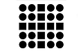
Proximity/Alignment another principal of design. Proximity/Alignment is when there is an image that has shapes that are the same but one or all except for one are not in place or out of order.
Balance another example of principal of design its like the image above. its like a picture of something and it like out of shape not the shape its supposed to be
journal entry #12

journal entry #13

Contrast a principal of design. light and dark shapes as shown in the picture.
journal entry #14
Emphasis a principal of design. when the artwork that is made its when there are the same shape but with a different colors or different size.

journal entry #15
Proximity/Alignment as a principal of design when a pattern has two or more shapes in it
journal entry #16
Balance a principal of design. when a peace of art it has to be balanced to make a design look more stable.

journal entry #17

Hierarchy a principal of design are Elements are treated graphically with graphic tools in order to form visual relationships and thus establish visual hierarchy across a design.
journal entry #18
Scale in principles of design. scale refers to the size of an object (the whole object) to another (whole object).

journal entry #19

Harmony unity as a principles of design. The repetition of design elements like color, texture, shape, and form is one of the easiest ways to achieve harmony to create a composition.
journal entry #20
Pattern as a principle of design. A pattern repeats its self. Patterns can be how ever you want like with colors, shape, and what ever you can imagine. Patterns don't have to be on paper or a computer they can be found all over.

journal entry #21

Repetition in principles of design. Repetition is the same like a pattern it repeats its self but changes once like the shape or color.
journal entry #22
journal entry #23
Rhythm/movement as a principles of design. Rhythm/movement is when the drawing looks like its moving or changing color.

Another project i would like to do in computer graphics is to make a self portrait with what ever we have learned.
Vigorous writing is concise. A sentence should contain no unnecessary words, a paragraph no unnecessary sentences, for the same reason that a drawing should have no unnecessary lines and a machine no unnecessary parts. This requires not that the writer make all his sentences short, or that he avoid all detail and treat his subjects only in outline, but that every word tell.”
—William Strunk Jr., The Elements of Style
journal entry #24
journal entry #25
i am wanting to travel the world because i have never been out of Albuquerque. i also want to go to a beach i have never been to one and when i see them in movies they look beautiful. i also have love to draw so i want to study arts.
i took a creative quiz and when i finished it said i'm very creative and i think thats good because i always think of things and they are creative
journal entry #26
journal entry #27
during spring brake i stayed at my house and was babysitting my younger siblings. when i wasn't babysitting i was st my friends house hanging out. that pretty much it.
bottom of page